Create a simple React button component with TailwindCSS

Hello learners!
This article will help you to build a custom react button component and you can use this button anywhere in your project.
If you don't know how to use tailwindcss with React, check my Article about it.
Perquisites
- understanding of HTML, CSS, JS
- Reactjs basics
- TailwindCSS basic
Let's get started!
Let start with the basics steps. Create a folder as component in the src folder of your project. Then create a file named button.js in the component folder.
Here I assume you already know about react app!
And start with React Functional component basic code!
//../src/component/button.js
import React from 'react'

function button() {
    return (
        <div>

        </div>
    )
}

export default button
As we need a dynamic button component, that we use the props to make a button dynamic.
Add props as a argument in button().
...
function button(props) {
    ...
Add <a> tag inside <div> tag.
<a class={`px-8 flex max-w-max items-center justify-center text-xs leading-snug border border-solid rounded-md text-${(props.color) ? props.text : "black"} py-3 hover:bg-white hover:border-${props.bg} hover:text-black bg-${props.bg}`}</a>
In class attributes we use tailwind class. If you don't know about tailwind class, then learn more about class in Tailwindcss docs.
Now see, what's inside the text-${ ... } ?. Here we use the Ternary operator to set the text color of a button. if we provide color for text, it takes that color for text, or else it takes default color as black text-${(props.color) ? props.text : "black"}.
example
<Button color="red"/>Note: want to learn more about Ternary operators? Click here.
Likewise we can set the dynamic background-color bg-${props.bg} and border-color while hovering hover:border-${props.bg}.
Note: we can provide any number of property in the button component, we access those properties through
props.
Next, add necessary attributes of <a> tag href and type.
<a class={...}
    href= {(props.href ? props.href : "#")}
    type="button"
    >
</a>
Here also we use the ternary operator, to get dynamic links from props.href . If we provide a link, it will take that otherwise it going with default #.
Finally, add dynamic button content. Use props.label inside the carly bracket { }.
<a class={...}
    href={...}
    type="button"
    >
        {props.label}
</a>
Now, our custom reusable button component is ready 🥳🥳.
Completed Code of a button.
//../src/component/button.js
import React from 'react'
function button(props) {
    return (
        <div>
            <a class={`px-8 flex max-w-max items-center justify-center text-xs leading-snug border border-solid rounded-md text-${(props.color) ? props.text : "white"} py-3   hover:bg-white hover:border-${props.bg} hover:text-black bg-${props.bg}`}
                href= {(props.href ? props.href : "#")}
                type="button">
                {props.label}
                </a>
        </div>
    )
}
export default button;
Okay, But how can we use this button component in our project? 🤔 💭
First select, In which file you want to use button and import button component from the component folder. Like below!
import Button from './component/button'
then use our button.
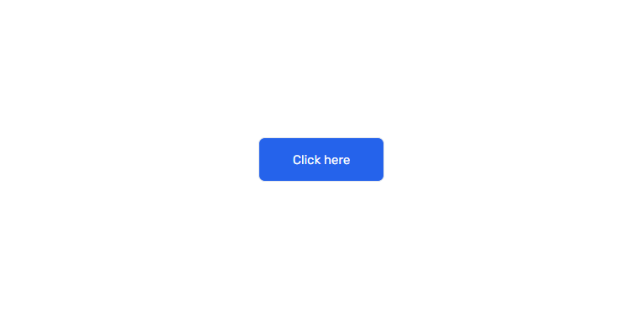
<Button label="Click here" href="https://google.com" color="white" bg="blue-600"/>
complete
App.jsfile code.//../App.js import React from 'react'; import Button from './component/button' function App() { return ( <div class="flex justify-center items-center w-screen h-screen"> <Button label="Click here" href="https://google.com" color="white" bg="blue-600"/> </div> ); } export default App;
output:
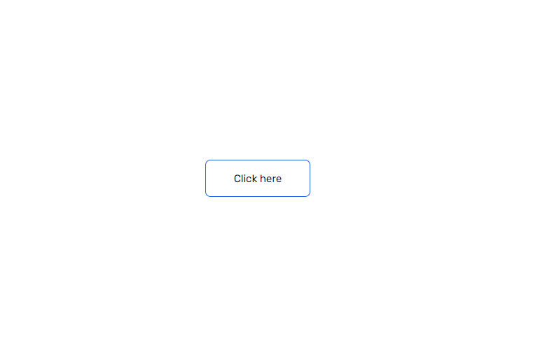
while hovering!
If you enjoyed learning and find it useful please do like and share so that, it reaches others as well 🤝
Thanks for reading 😃
I would ❤ to connect with you at Twitter | LinkedIn | GitHub.
Let me know in the comment section if you have any doubt or feedback.
See you in my next Blog article, Take care!!
Happy Learning😃😃


